
The new neutrals: how to do beige (but not in a boring way)
/
AD | This post is part of a paid partnership with Artfinder and includes affiliate links.
For most of my life I’ve been a staunch supporter and probably even an honorary member of the Beige is Bland club. Hearing the word neutral is more likely to make me think of tubs of trade white and decorating indecision than sheepskin-lined Nordic cabins or plush Kelly Hoppen pads.
But having just swapped a Victorian terrace in the city for a Georgian country house, the style I loved in our East London life doesn’t necessarily translate in an historic home with roughhewn oak beams and ombre sunsets in giant Suffolk skies. My old go-to neutral, a soft pure white, feels a little too clean for muddy boots and gravel drives.

the freshly revamped sitting room in our new place, painted in mylands messel (door), hoxton grey (walls & woodwork) and egyptian red, a colour from the mylands archives (window). paint gifted as part of a collaboration.
So I’ve been pondering how to nail these earthier neutral schemes in a way that isn’t too safe or soulless. And because art can be such an impactful and affordable way to set the tone, I’ve teamed up with Artfinder – the online art marketplace that connects buyers with independent artist – to share my tips for creating a subtle space that’s warm and cocooning yet sophisticated. With a dash of the dramatic too.

Whether you’re in a gritty warehouse conversion in Bermondsey or a quaint Cotswold cottage I hope my curated collection of pieces by Artfinder artists in fawny earth-inspired hues will help you find the perfect piece for your café au lait space.
Okay, so…what are the new neutrals, then?
Think warm stone, ecru and muddy taupe shades for your base. Like unbleached linen, fields of wheat and pebbles on the beach. With earthy accents – mounds of moss on the damp forest floor, rusty wrought iron gates creaking in the breeze and the golden browns of fluttering, falling leaves. Annnnd relax.
Right. Well that sounds idyllic and all but won’t it look a bit (circle as appropriate) uninspired / dull as daily Zoom calls / the interiors equivalent of existential boredom?
Aha! Great question but the answer is no. Read on, dear reader, read on and I’ll tell you all you need to know.

CONTRAST
This is where you’ll get that little bit of mischief. A hint of home design danger. A dose of Villanelle for your Eve-y digs.
If the walls/ceilings and other large elements in a room are light neutrals, go on and embrace that sinister darkness. Blacks, browns, murky olives or deep amber like Corten steel. Pick your favourite and add it generously with furniture, lighting, art, contrasting woodwork or accessories.
Products pictured (clockwise from top left):
Check linen & organic cotton duvet set, Mother of Pearl at John Lewis
Vetro table lamp, MADE
Mini bamboo stool, Tine K Home at Design Vintage
Fine edge mirror organic, Heals
Pavia wide chest of drawers, MADE
Original linocut print by Mirta Artworks at Artfinder
Patterned cushion cover, H&M Home
Bamboo rim rectangular storage basket, John Lewis
Ink drawing by Marcel Garbi at Artfinder

TEXTURE
Consider this the plot thickener. When you’re going for a mostly monochromatic colour scheme, texture is everything. Avoid beige blandness by layering on loads of texture.
Pair linen with corduroy or velvet, wood grain with woven baskets or cane. Mix subdued matte finishes with concrete or a patinated, flaky-painted antique. Tactile surfaces are the dramatic twists and turns whilst the limited colour palette will keep the storyline feeling cohesive.
Products pictured (clockwise from top left):
Acrylic painting, Anita Kaufmann at Artfinder
Baulin crinkled linen lampshade, La Redoute
Etna lamp base, Light & Living at Ideas 4 Lighting
Monolit sideboard, Ethnicraft at Amara
Nanded side table, House Doctor at Amara
Model 03, 3 seater sofa, Swyft
Square velvet cushion cover, Toast
Cam seagrass storage basket, MADE
Linocut print by Amy Cundall at Artfinder
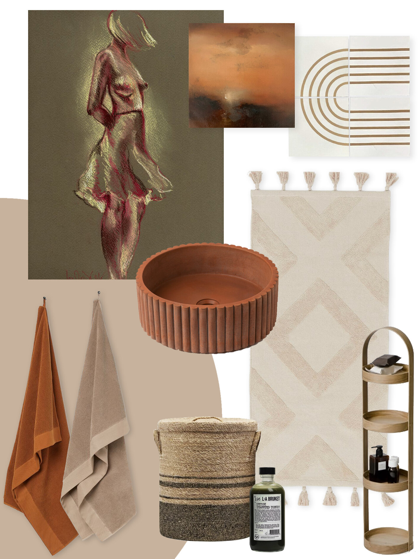
SHAPE
This is your cinematography and it’s all in the composition. Avoid any hint of humdrum with some zeitgeisty contours. Shape defines the times in any design genre and homeware is no exception. Add some updated art deco arcs and scallops or channel your inner harmony with organic Japandi pebble shapes and minimalist freeform lines.
Products pictured (clockwise from top left):
Pastel drawing by Louise Diggle at Artfinder
Oil painting by Elena Troyanskaya at Artfinder
Marigold maze encaustic tiles, Bert & May
Tasseled bath mat, H&M Home
Oak bathroom caddy, Wireworks at Amara
Seaweed bath tonic, L:A Bruket from Forest at Trouva
Striped seagrass laundry basket by House Doctor at Design Vintage
Scallop concrete sink, Smith & Goat
Cotton terry bath towels, H&M Home
Well I guess that’s me officially resigned from Club Beige is Bland. How about you?
Artfinder is an art marketplace (and a certified B Corp – hurray!) that connects buyers with independent artists. Featuring 15,000 new artworks each month by 7,000 artists around the world, their mission is to give art-lovers access to the widest range of original art possible, and help more artists to make a living from their work at the same time. Because wouldn’t a world without art be beig….err, boring.